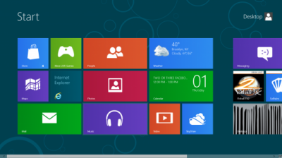
So this is apparently the new Windows 8 Metro start screen (for mobile devices, but also for the computer desktop).
Apart from the dull and dated 1990s look and the clashing colors, how is one supposed to read the tiny lettering on the control surfaces?
Did Microsoft outsource their design to India? Are they kidding? They want to compete against Apple’s iOS 5 and Android with this??
I almost feel bad for them. I was hoping that Microsoft would come up with something serious, because I believe Apple must have competition to thrive. (Android hardly counts, because Apple users won’t even consider touching it with a pole).
If this is all Microsoft is still able to cook up, I am afraid they are done.

